Concept Washroom, A New look for a new OPPORTUNIty
Concept Washrooms approached me a difficult challenge they had. They were expanding their reach, and repositioning themselves as the experts in Commercial washroom fit-outs. The problems we faced initially were they had a name change which is always a big change, as the name of the business usually has a lot of goodwill built up, so we had to preserve parts of the old brand, such as purpose, mission and values, but then show we are new, and better then ever before.
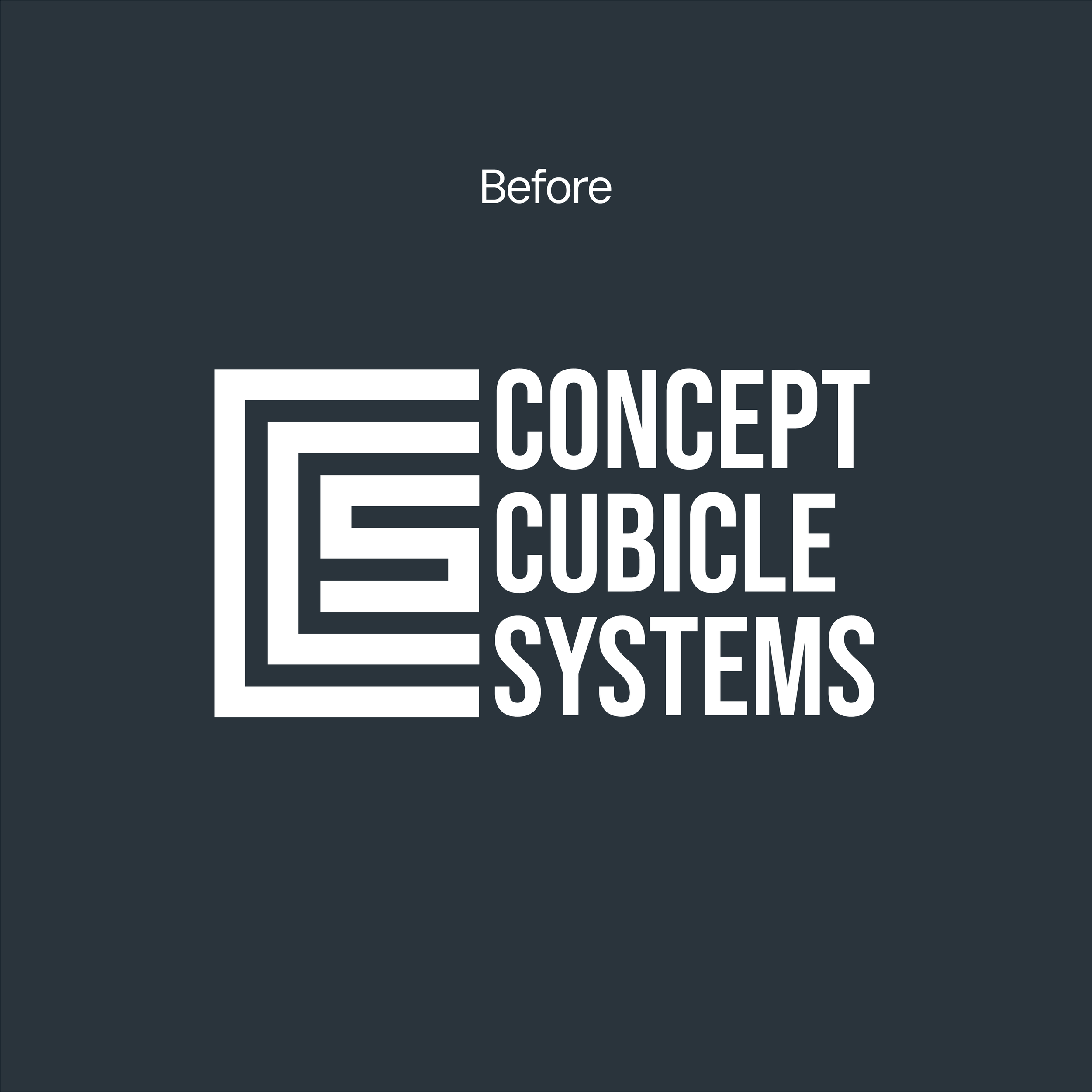
Another challenge we had was visually Concept had a very dated brand which was not updated in years, so we knew very quickly this was a core focus of the brand identity project.
Setting the foundation
We uncovered their unique selling point against their competitors early on to give them a clear edge. We found that in the market Concept acted as a partner to Architects, where they help from the initial planning stage all the way to the final build and installation, which is where we got the “A-Z” concept in our messaging.
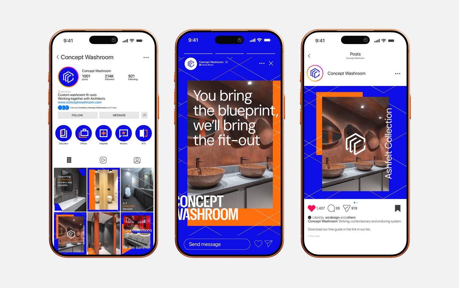
Because of this insight, we knew our main audience was Architects, so it was important that our visuals targeted and resonated with them first, and secondly with everyone else.
Time to
stand out
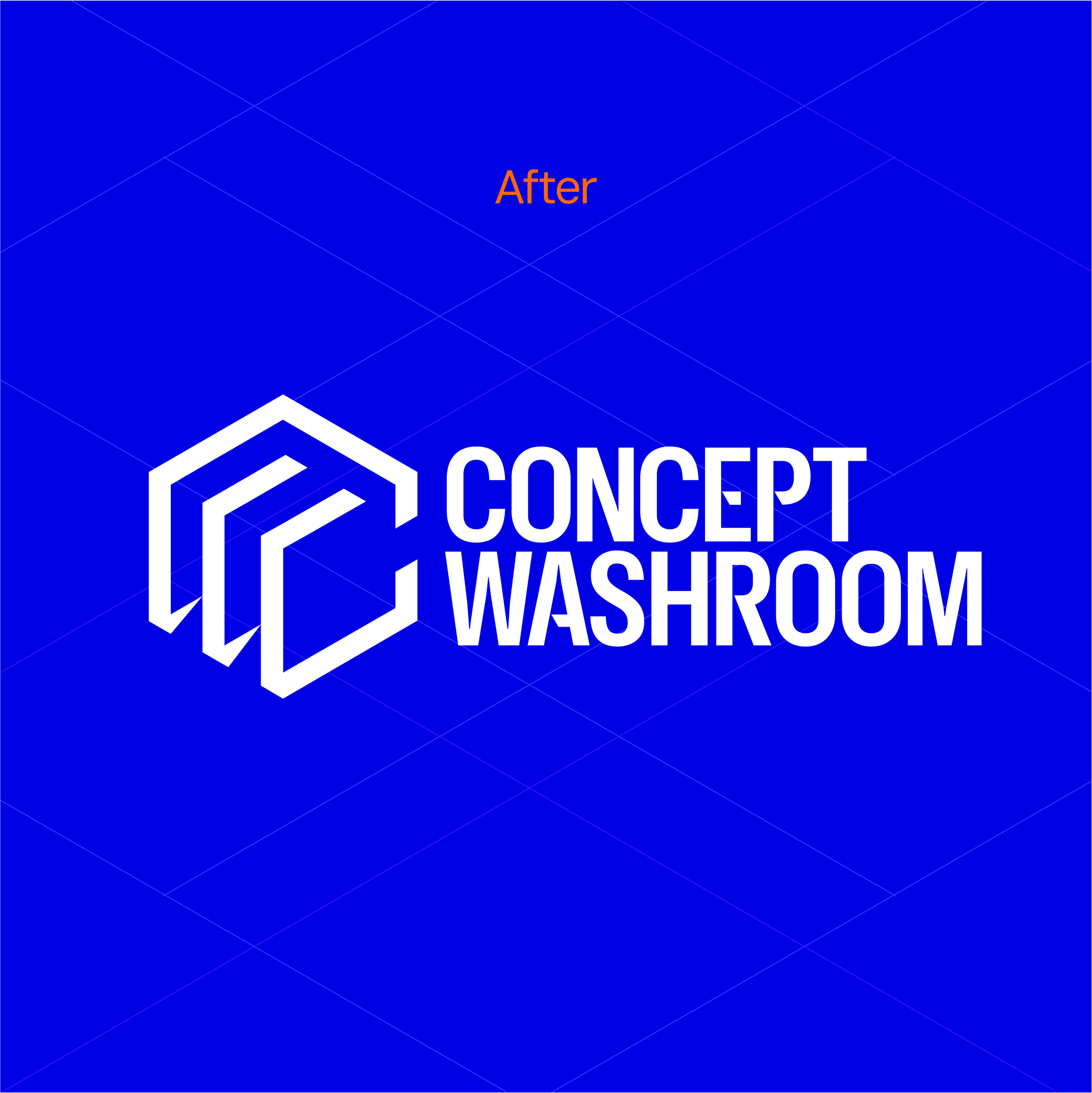
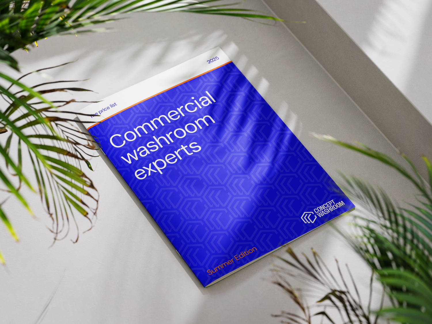
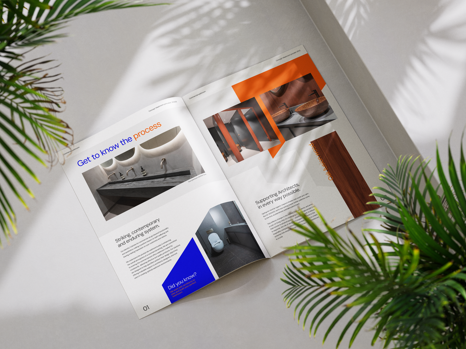
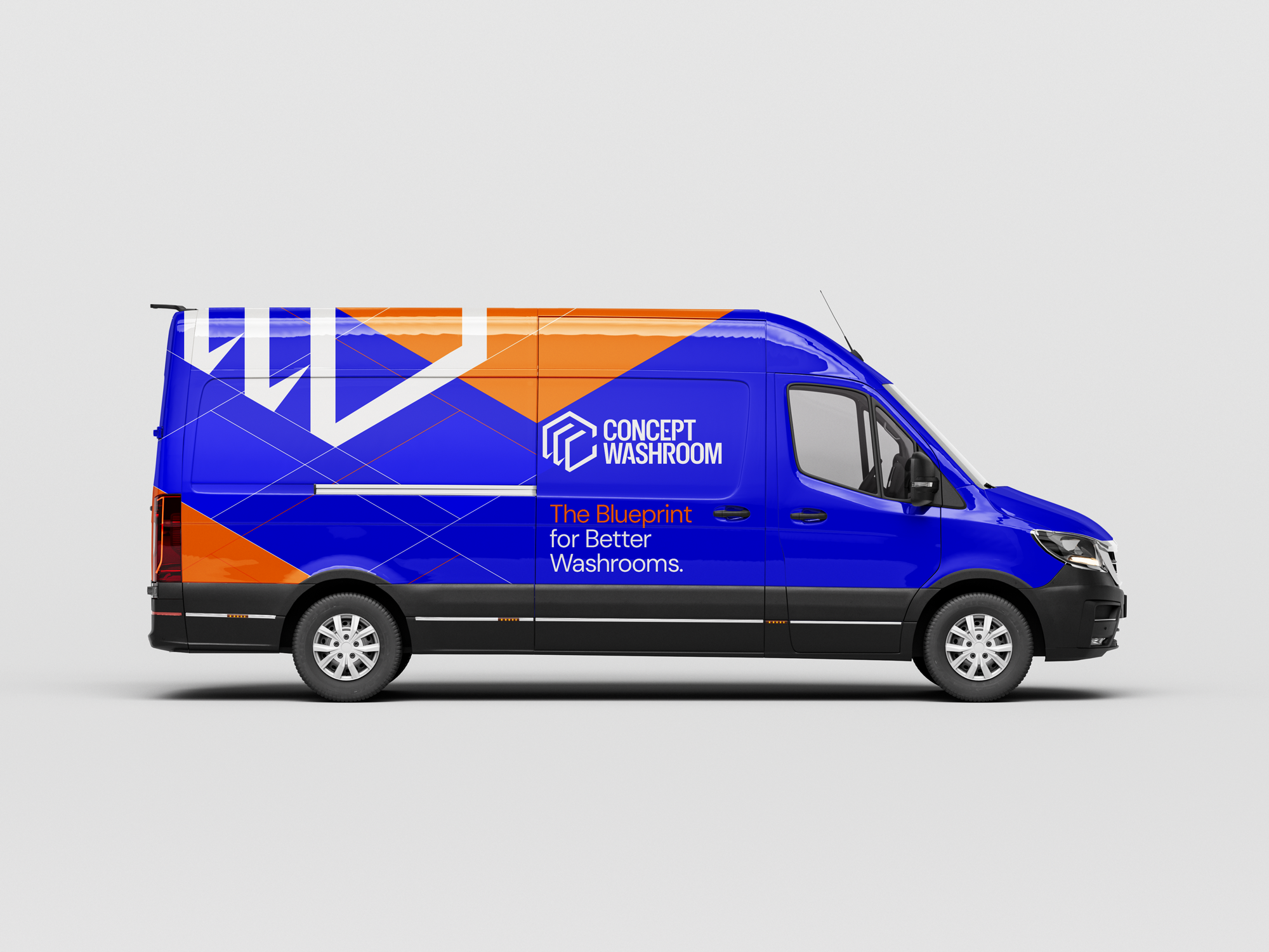
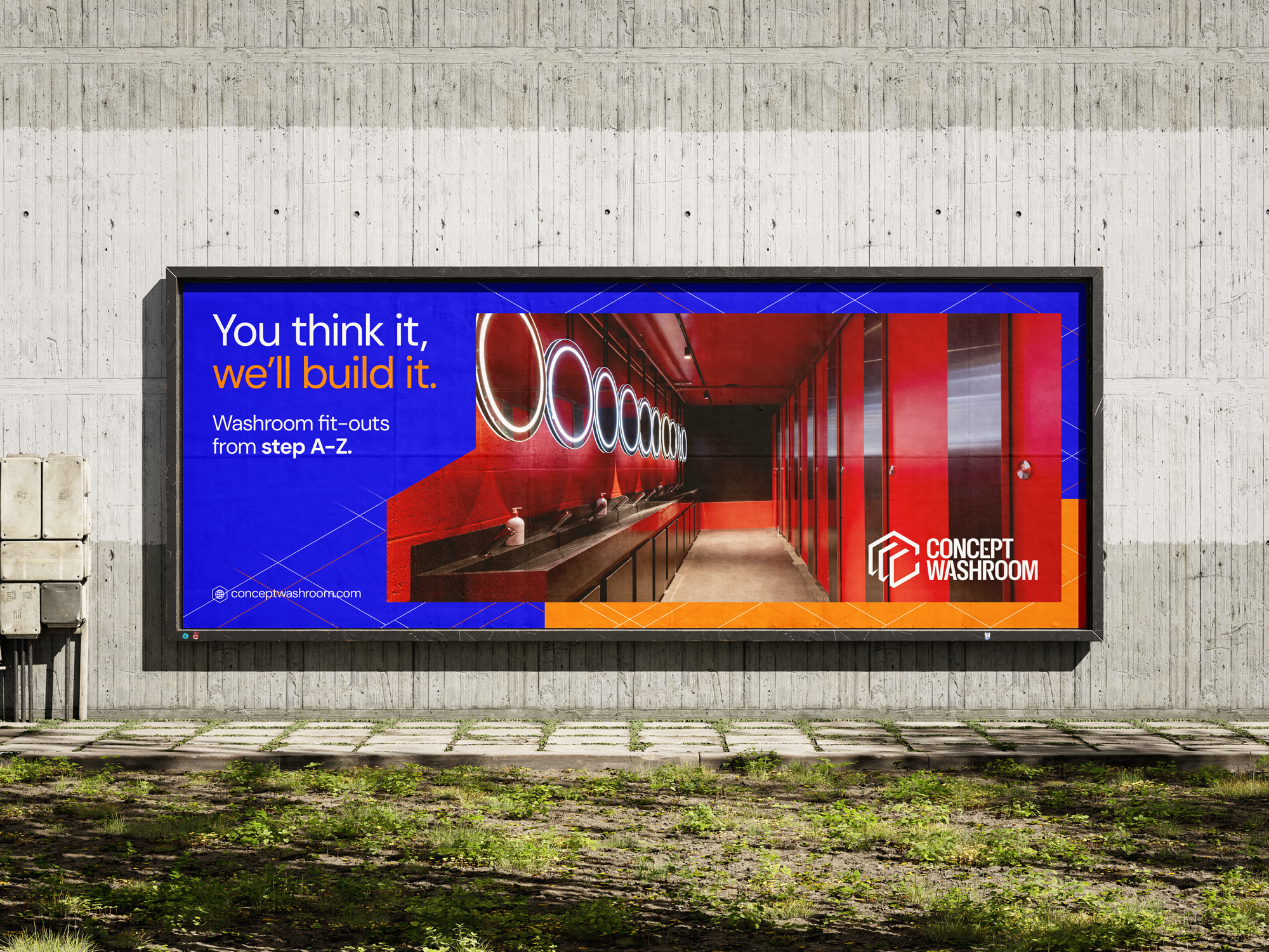
In the design phase we decided to really push our style to stand out from the market. Most competitors would use symbols of water to represent their companies, and a generic use of white and light turquoise was a colour that kept coming up. We went in another director. We used an electric blue to match with the blue print phase we help the architects with, also signalling trust and authority based on colour theory. And then we added as an accent colour a bright brash orange, to show the companies friendly, helpful and warm tone, discovered in the strategy stage. We then rolled this out onto social, print and other company assets.