FC Barcelona, a brand going back to it’s amazing roots
Setting the foundation
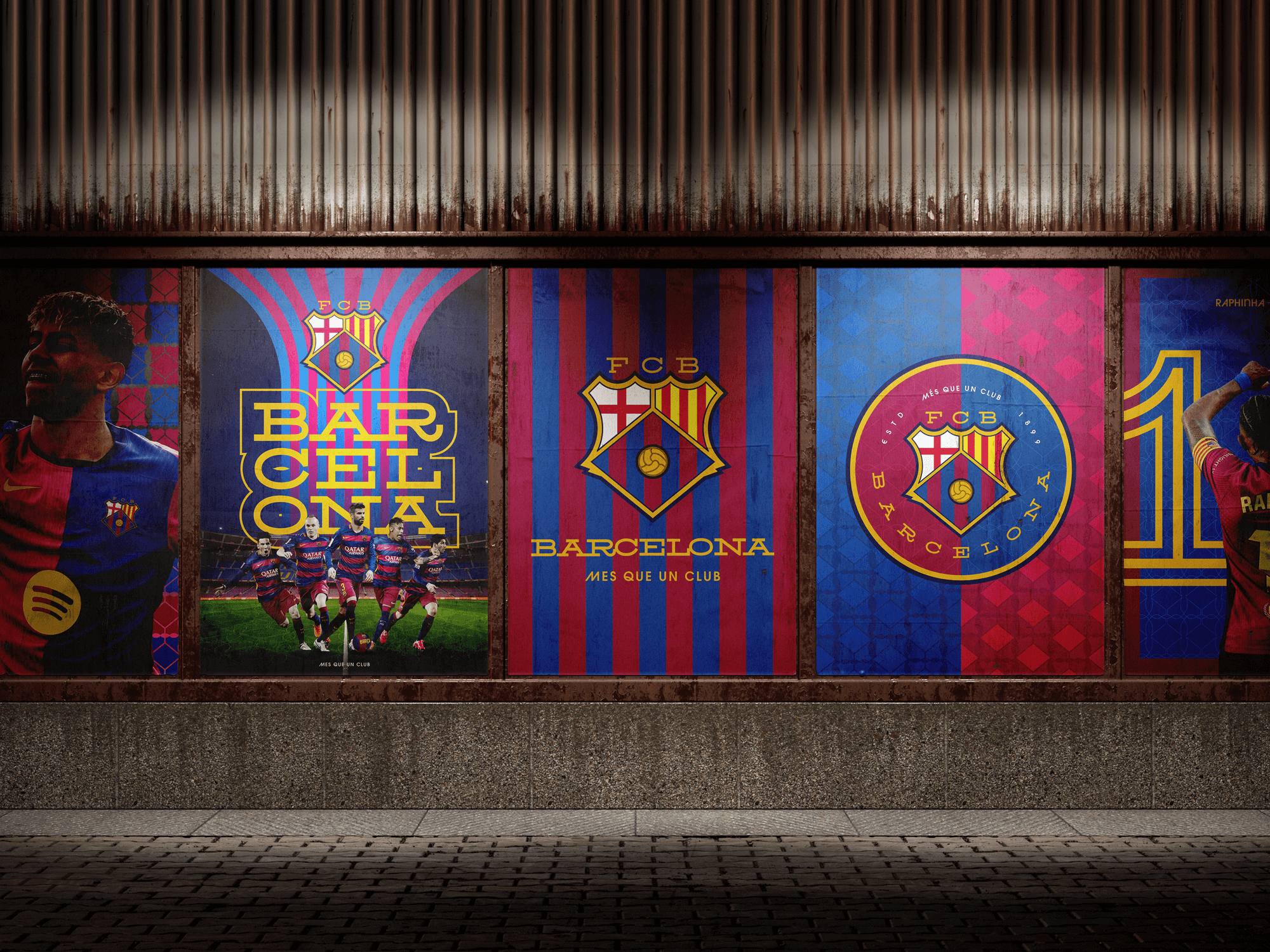
This project was created to be delivered as a learning piece for other Brand identity designers. It all started when I saw a YouTube video from GQ Sport titled, “How to Rebrand Barcelona FC”, and while watching I noticed so many steps were missed, and overall it was a logo redesign, not a ‘rebrand’. So I saw this a opportunity to create my own version and show designers and business owners alike, that when working with large brands with prestige how a rebrand is actually done.
Time to
stand out
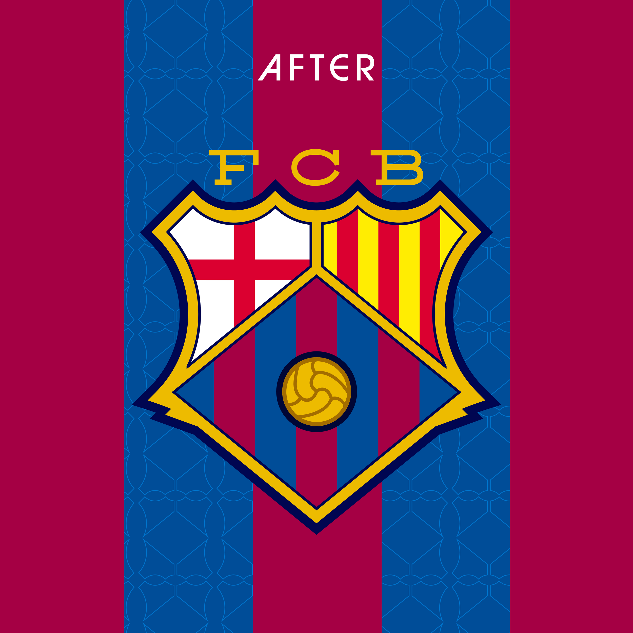
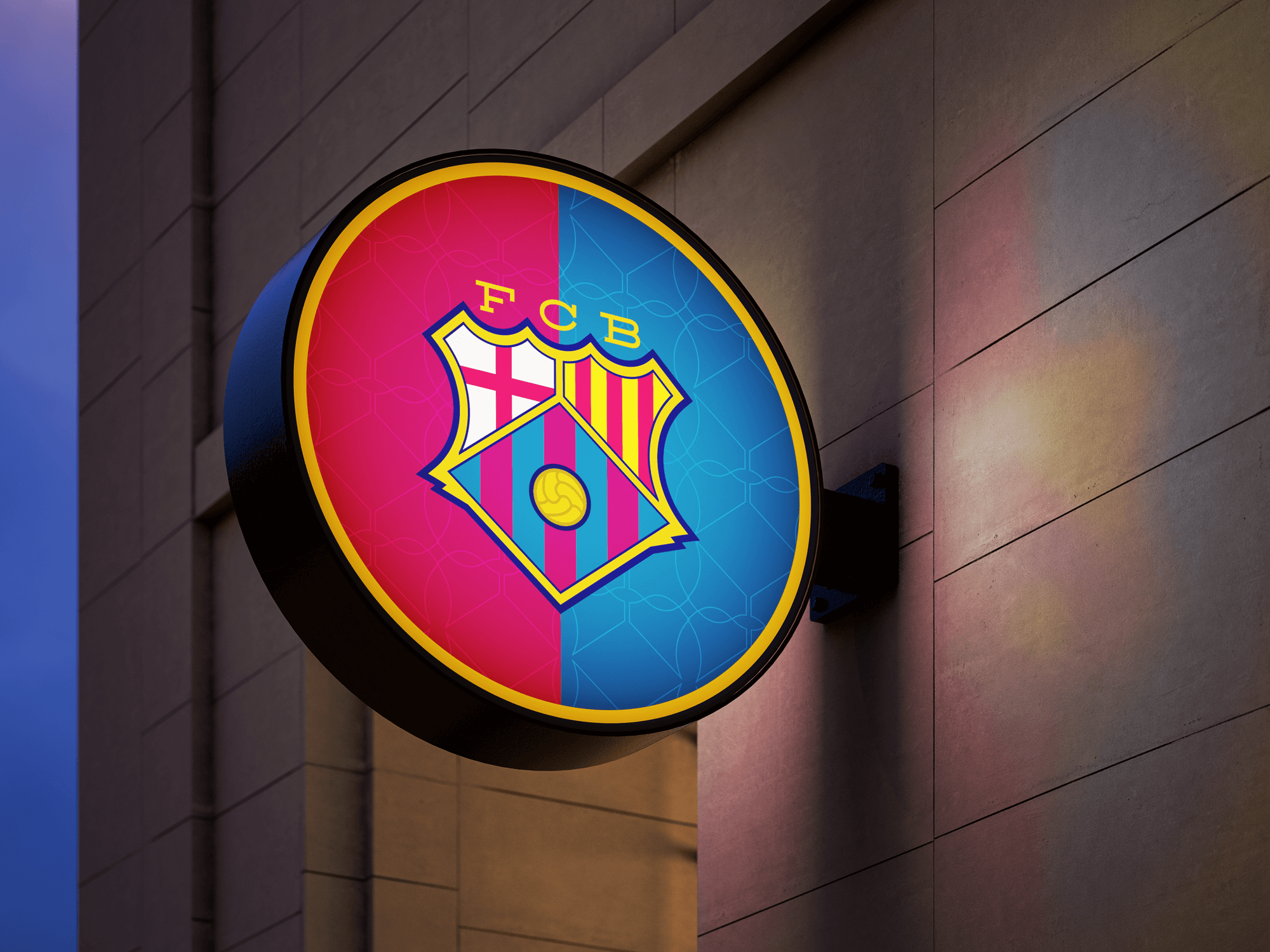
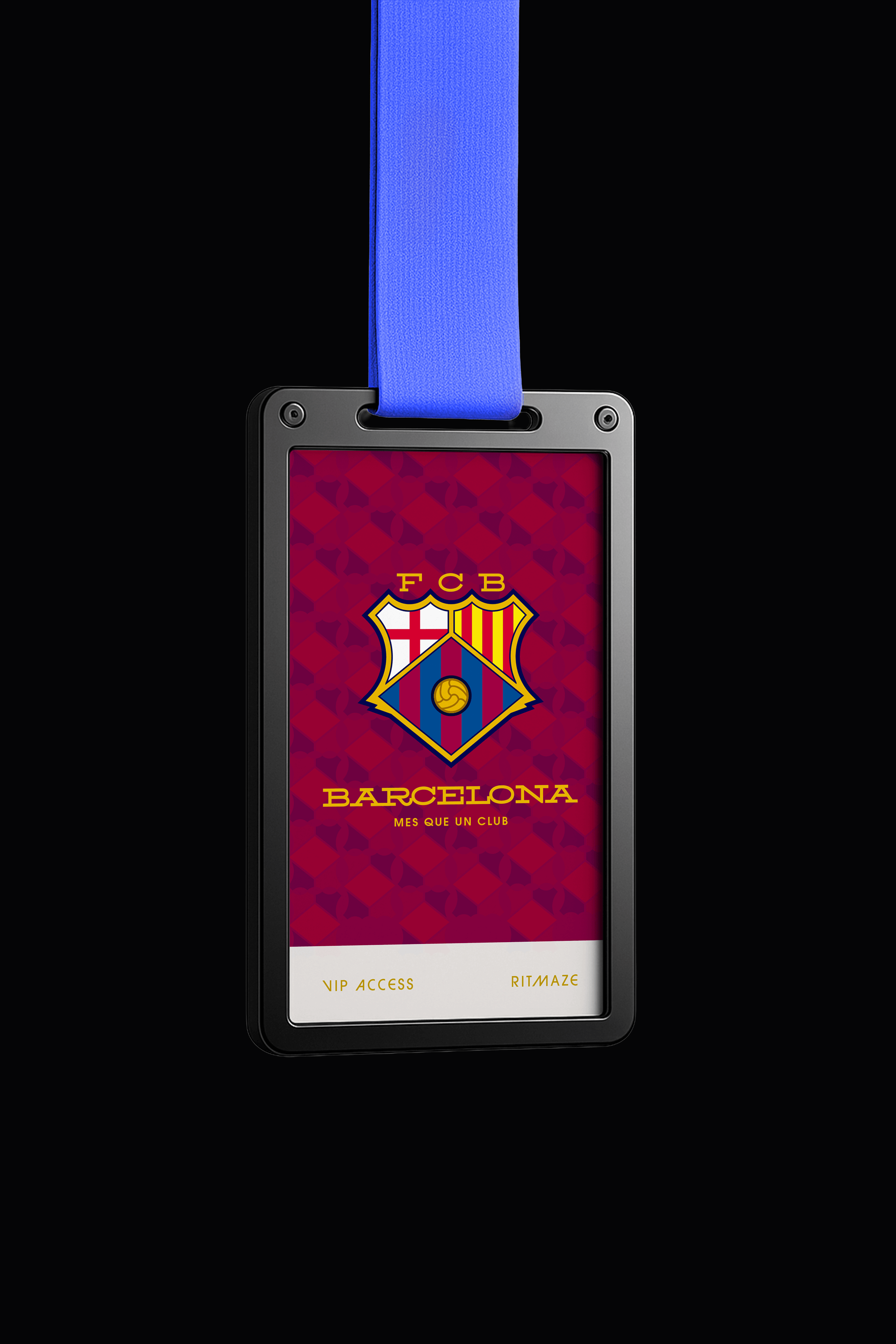
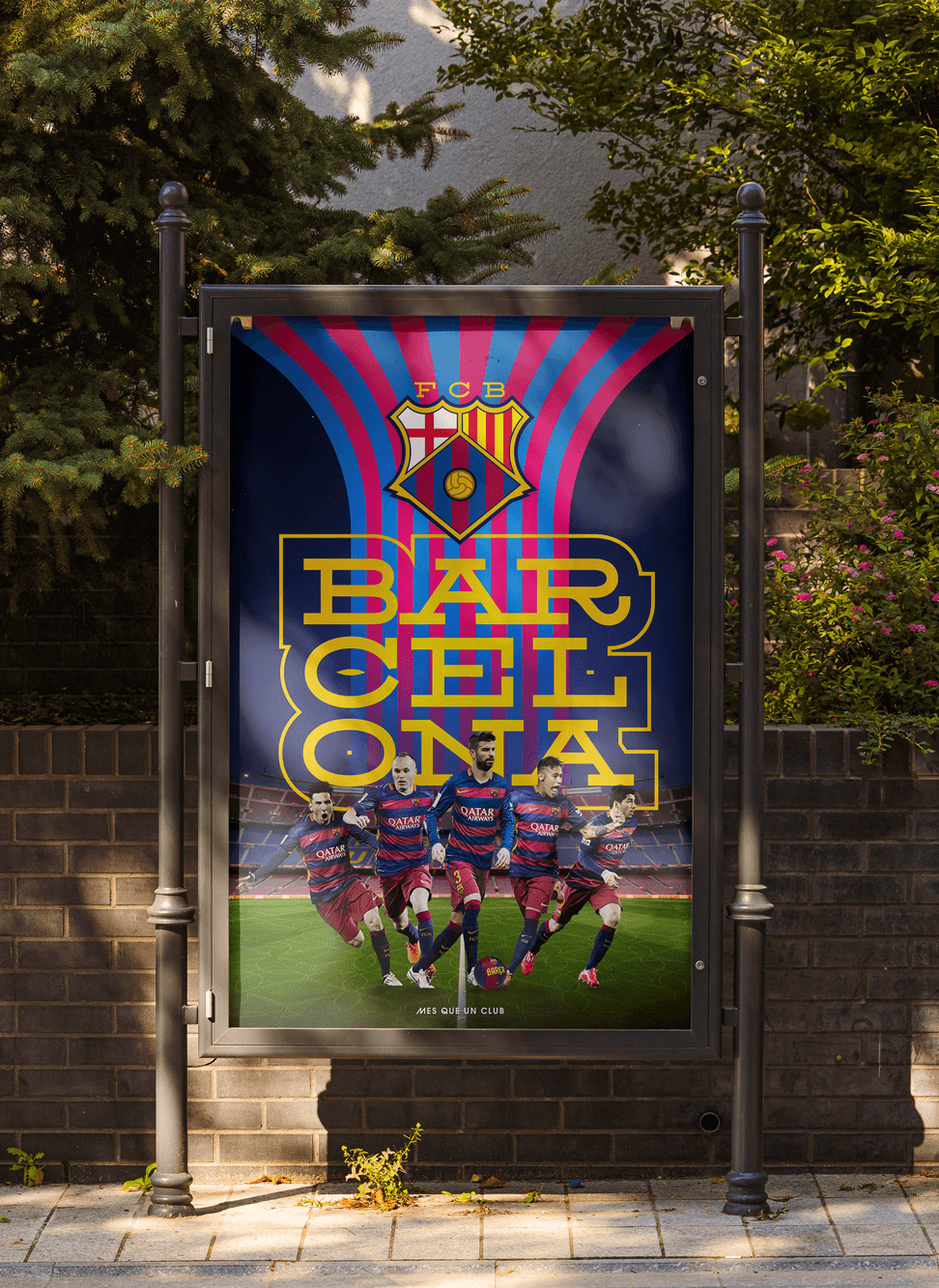
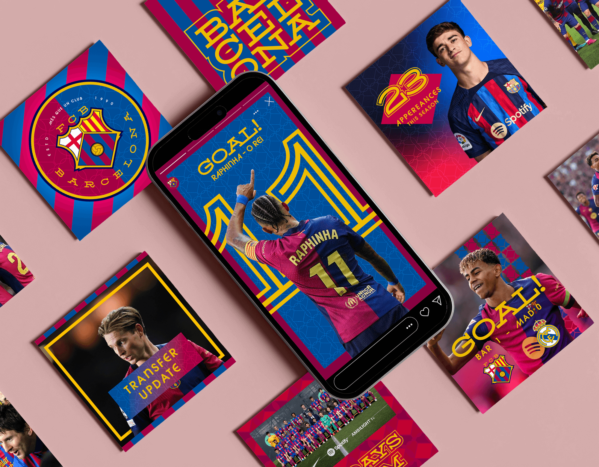
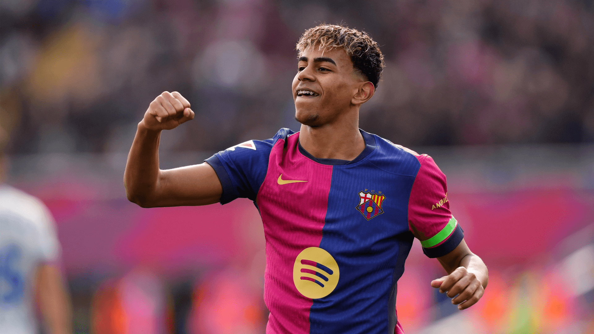
After the strategy and planning phase, it gave me some real insight into the club and the city, and I took inspiration from the history, previous logos, looked into parts of the brand that could not be replaced, and must be included to keep the feeling of the club, and then added elements to modernise the badge, and the rest of the brands look and feel, and the outcome was something I was proud of indeed.
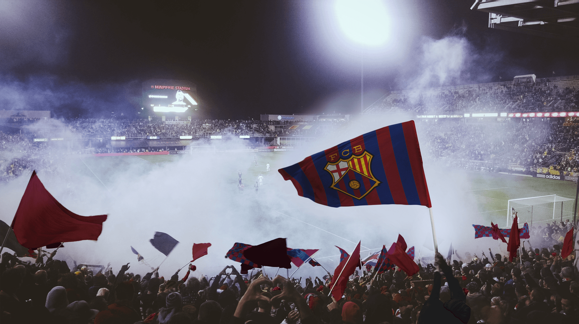
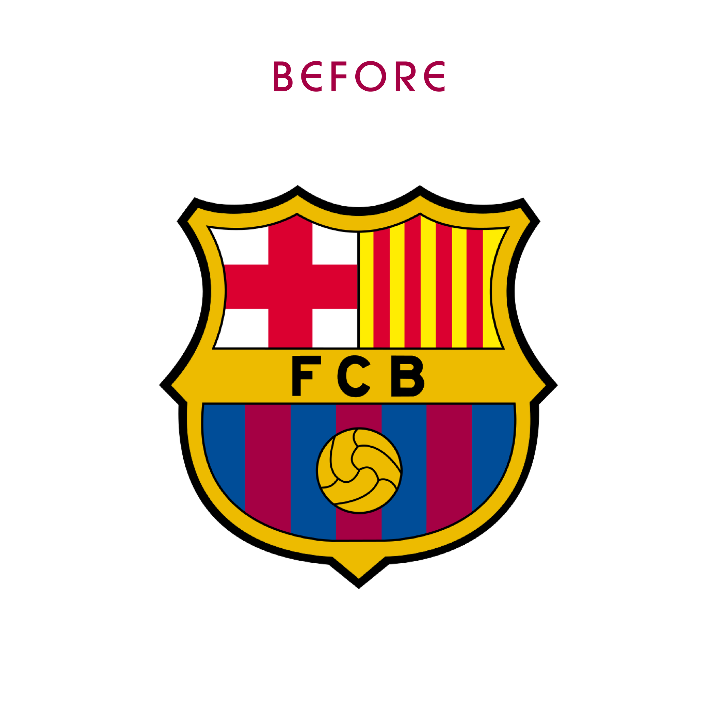
I started out with the research phase, looking at the clubs ethos, their history, what they stand for, and also where they are from. Having lived in Barcelona myself, I understood what the club meant to its fans, how proud they are to be Catalan, and also how the whole city is so unique. Their slogan tied into this with ‘Més que un club‘ which stands for More than a club, which is exactly what it is, it’s passion, it’s pride, it’s the peoples, it’s the streets, it’s Antoni Gaudi, it’s all connected. With this research and strategy in place, I could move onto the visual design stage.